RECKSTAR
Recent Starblogs
- Putting Reckstar on Pause March 28, 2016
- We Got Reviewed – The Comics Alternative likes Reckstar! February 3, 2016
- This week’s comic (1/12/2016) will be postponed January 11, 2016
- Dave Jordan’s Sadman (now with 50% more Reckstar) December 27, 2015
- Star Wars: The Force Awakens – Review December 22, 2015
More Cool Comics!
Shamsee
by Tristan J. Tarwater & Adrian Ricker
The Last Diplomat
by Cat Farris
Full Circle
by Taneka Stotts, Christianne Goudreau, and Genue Revuelta
Spacetrawler
by Chris Baldwin
Starslip
by Kris Straub
Perils on Planet X
by Christopher Mills & Gene Gonzales
Dresden Codak
by Aaron Diaz
Questionable Content
by Jeph Jacques
Freakangels
by Warren Ellis & Paul Duffield
Lady Sabre and the Pirates of the Ineffable Aether
by Greg Rucka & Rick Butchett
The Abominable Charles Christopher
by Karl Kerschl
Goblins
by Tarol Hunt
Gunnerkrigg Court
by Tom Siddell
The Unsounded
by Ashley Cope
Broodhollow
by Kris Straub
Lovecraft is Missing
by Larry Latham
Steve Rogers' American Captain
by Robyn
JL8
by Yale Stewart
Reckstar Chapters
Reckstar Across the Web
Categories
©2014-2018 RECKSTAR | Powered by WordPress with ComicPress | Subscribe: RSS | Back to Top ↑


Wow!
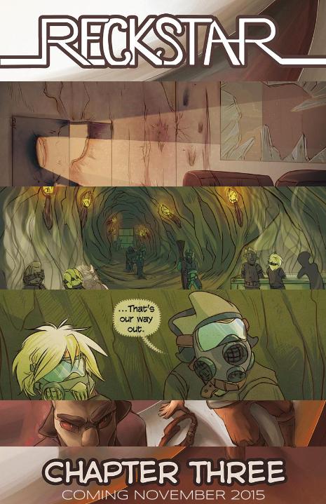
Did the art style change a lot? Or is this just for the poster? 🙂 Great work!
A little bit of both? Like previous covers, this one is going to have a painted look (I previewed it here: http://reckstarcomic.com/2015/07/07/the-coming-hiatus/). Aside from that, the rest of the image is made up of snippets from the actual pages, which are the same art style, but the colors are definitely INTENSE.
It’s gonna be a little bit of a darker chapter. Just a lil bit.